If you would like to receive weekly updates like this, sign up here.
“Investors who are male, or above the age of 45, or married, or have more dependents, or who self-identify as having excellent investment experience or knowledge tend to freak out with greater frequency.”
So says a recent report by Massachusetts Institute of Technology’s (MIT) Laboratory for Financial Engineering.
Didn’t that little sentence put me right in my place!
It was one of several findings this MIT group discovered when they accessed anomalously 653,455 individual brokerage accounts across the US.
They gathered the buying and selling decisions across the duration of the study from 2003 to 2015 (so this included the 2008 financial crisis) and then applied neural learning algorithms and artificial intelligence to these decisions.
The study was designed to see if they could develop a way of predicting panic selling more accurately – who panicked the most and how often and, crucially, when they did so.
Today, we will look at the report’s most important findings.
One recurring aspect of behaviour will leave you shocked.
And you need to pay attention because it could well be something that you have done, or indeed continue to do now.
You will NEVER make money in the market long term if you react like this.
It will, however, guarantee losses, repeatedly.
Scared yet? You better read on.
Opportunity cost
We won’t go too deeply into the modelling and the new behavioural sciences that are being applied here.
What is more important is some of the results this research unearthed.
They validate for me something I have long suspected.
Anyway, here is the background behind the report.
“Behavioural finance has documented a wide range of stylized actions of investors, including loss aversion, regret aversion and overtrading…
There has been renewed interest in these behavioural patterns since the financial crisis of 2007-2008, both within the academic community and among the public.
We summarize several documented investor behaviours, some which are related to panic selling, and others which are inconsistent with the phenomenon.”
So, in other words, identify a particular market event (e.g., a market panic) and then note what the test group did or didn’t do both before, during and after said event.
And, to no surprise, it identified overconfidence (or panic) based on price momentum.
In other words, when markets are moving consistently in one direction, investors assume that this will continue.
Continued upwards movement during a favourable market and the opposite when price falls due to a panic.
That makes sense.
It is something you can most identify with too.
It feels great when you enter a trade and all it does is go up. If your portfolio is displaying similar performance too, then one’s confidence is bound to rise.
Why would you consider selling?
But when your account is displaying a sea of red, how do you feel then?
This is when the emotions threaten to take over and hence you can overreact and panic. Many studies of the market over the last few decades have come to similar conclusions.
This MIT report, however, took this point a bit further.
What is the opportunity cost when you panic during a market fall? The study went very deep into what exactly this opportunity cost is, and how it affects your long-term returns.
I have known this to be true for many years. But I haven’t yet seen such research that could quantify it via the actual brokerage accounts of those affected.
This report was able to demonstrate the difference between those who panic sold their shares during a crash and didn’t re-enter the market, and those who sold but eventually did re-enter.
I could show you that crash via a chart of course but many of you reading this may not remember nor indeed have been active market participants back then.
However, we did have a decent correction not that long ago which you may be more readily able to identify with.
Let me show you the effect the February to March 2020 COVID related market crash looked like.
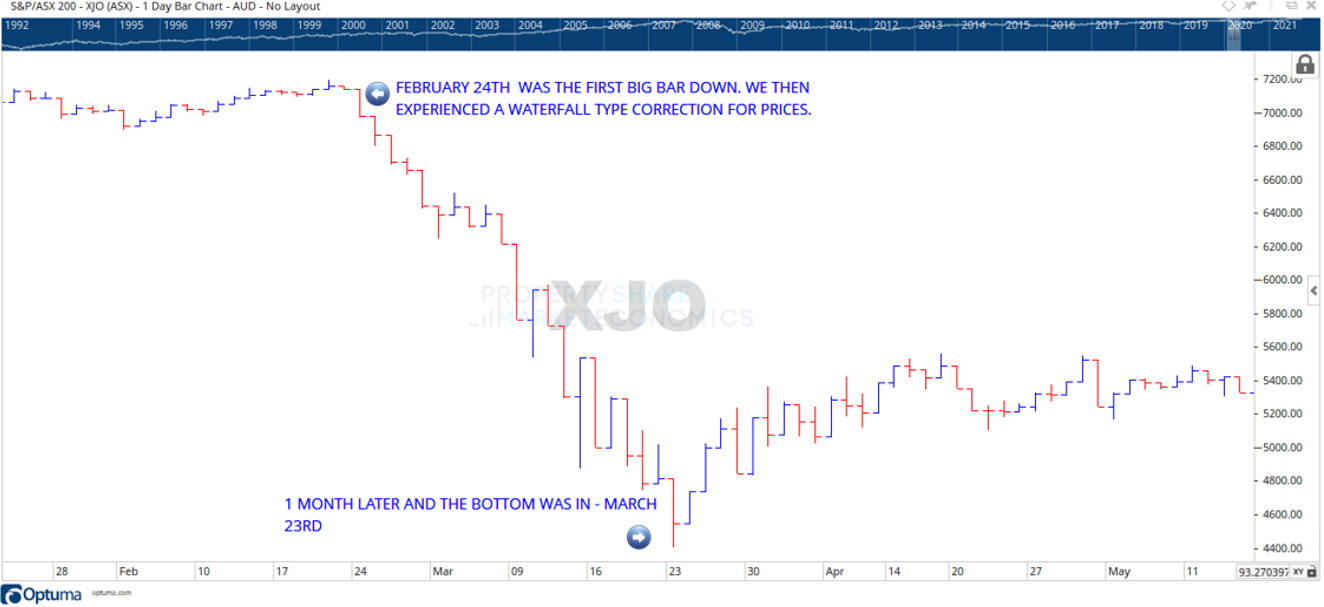
Here is the chart for the ASX-200 Index (ASX – XJO). Click on it to open it in a new browser.
I’ve highlighted the 1-month period of panic as the realities of the COVID related outbreak and subsequent economic lockdown were digested by the markets.
Do you recall this time?
Can you remember what the headlines were like, the way the news media was reporting it?
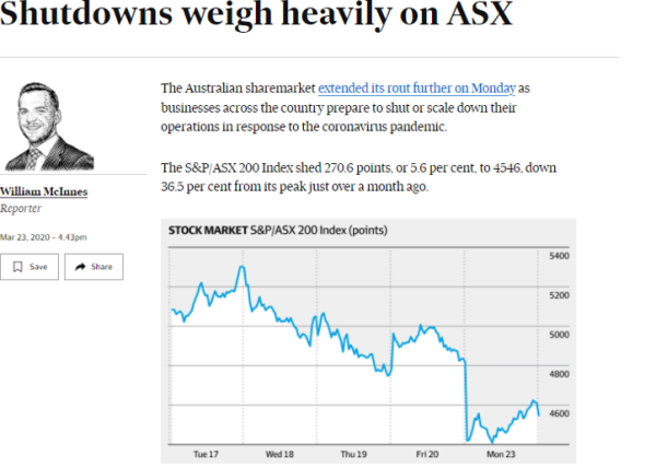
 Source: AFR
The above article was published on the day of the low.
If you happened to have had significant capital tied up in markets on this day, how would reading that have made you feel?
Or you were one of the few who made a quick exit from the crash sometime during the first week or so?
Your emotions upon reading that same headline would be quite different I’d imagine.
Well guess what; if you did sell out early you may still have lost!
It was, as this report found, what you did, or didn’t do, after the crash that makes the biggest difference to your long-term wealth.
Not when you sold, or why.
Crisis and freak outs.
This next paragraph is critical to understand.
Using the above chart, we will use the report as our guide and label the beginning of the crash as the ‘crises’ and the subsequent selling as the ‘freak out.’
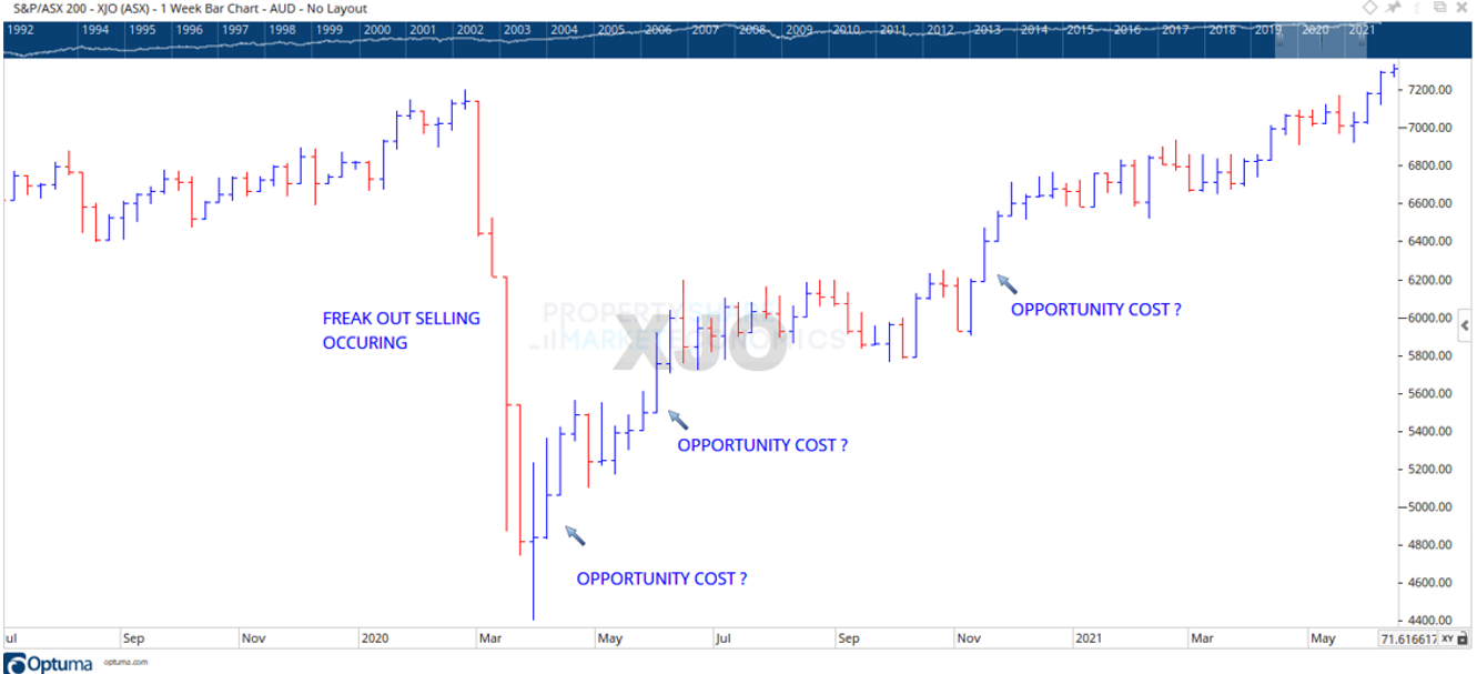
Take another look below, this time a weekly chart.
You can see the selling, a ‘waterfall’ pattern.
Do note though I’ve marked three parts of the subsequent recovery as a “opportunity cost?”
From that March 23rd bottom in 2020, look across to the far right of the chart. Can you see where on the chart the largest blue bars are?
All were within the first 90 days of the ‘V’ shaped recovery.
The XJO lost 2794 points between February 20th to March 23rd, 2020. In the subsequent 90 days from that March 23rd date, the XJO gained 1796 points to 10th June 2020.
Almost 60% of what the market lost was regained in that same 90 odd day period.
If you liquidated your portfolio anytime during that 1-month freefall, and didn’t re-enter for another 3-months, you missed that entire bounce!
Your next chance was that move from November to December 2020, which I’ve marked as the third opportunity cost insert.
But even that few strong months of gains pales compared to what you could have achieved in the first 3 months.
Amazingly, those who had a ‘buy-and-hold’ mentality during this time captured all of it, relative to when those investors who sold re-entered the market.
(Akhil Patel) Awesome economist and a super nice guy…his commentary and advice is invaluable in my investment decisions. -Silvio
Ok, time to apply some context here.
Now, this is what I’m not saying.
I’m not saying you were wrong to sell either before, during or after this correction.
We aren’t looking at this in absolutes.
I can guarantee that everyone who sold during this time (and incidentally during the time covered by the MIT study) did so due to their own personal and individual circumstances.
This is how it should be.
I’m confident there were folks who sold everything, some who closed their most speculative positions and held onto a handful of strategic long-term holdings.
Regardless, there would have been a personal decision made that at the time was the correct one.
Your key takeaway from this research is that it seems most of those brokerage accounts which were measured between 2003 to 2015 had no idea what opportunity cost was and how it affected long term stock market performance.
At least when measured against their buy and sell decisions around and after the so-called GFC.
Because it was a much bigger crash, the 2008 bear market involved more money, more emotion and more ‘freak outs’ than the one we had recently in 2020.
 Source: (MIT) – Laboratory for Financial Engineering
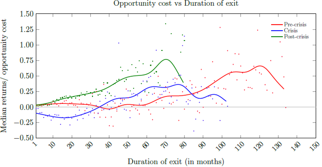
Here is a graph from the report. Let me explain it in simple terms.
It charts the pre-crisis (red line from Jan 2003 to April 2007), crisis (May 2007 to February 2009) and post-crisis (March 2009 to December 2015).
The left-hand axis defines median or average returns with a sliding scale indicating the opportunity cost.
Basically, at 0.00, there was no cost to you being out of the market. When the numbers negative it means your capital has been protected from further damage as the market continued to fall.
Therefore, you ‘gain’ here because you aren’t losing more than you have already.
Finally, between 0.00 to 1.50 means the higher you go, the more you have missed out by not re-entering the market.
The axis along the bottom is the duration of time spent out of the markets expressed as months.
Note the green line. Can you see how, after the crisis is over, the longer you wait to re-enter the higher your opportunity costs to do so?
Exactly the point I’m making with the chart of the XJO.
See the blue line in relation to the first 30 months on the left-hand side. It is in negative territory; you are all out at this stage and have preserved capital, the right decision.
And even so, that blue line is still below the green when expressed as median returns. The longer you wait to re-enter the market the more it’s costing you!
This must be a part of your strategy.
Finally, we have at hand one method to quantify the importance of your timing with this MIT report.
But it’s not all bad.
Freaking out and panic have negative connotations.
While panic selling in normal market conditions is indeed harmful to the median retail investor, freaking out in environments of sustained market decline prevents further losses and protects one’s capital.
I’m sure you can see this now.
Another conclusion this report reached was the correlation between overtrading and behaviour.
The likelihood of a panic sale increases with the percentage of daily trades made by the investor.
Does that explain this?
“Investors who are male, or above the age of 45, or married, or have more dependents, or who self-identify as having excellent investment experience or knowledge tend to freak out with greater frequency.”
I think it might. Consider that age 45 is normally prime earning years, the fact most brokerage accounts for this demographic listed them with “excellent investment experience” which means they are familiar or indeed trade with derivatives, say like options.
Then consider this finding.
“Furthermore, an investor will be more likely to panic sell if options compose a larger proportion of the entire portfolio.
The occupational groups with the three highest risks of panic selling are `self-employed’, `owners’ and `real estate’, while the three occupational groups with the least risk of panic selling are `paralegal’, `minor’ and `social worker’.”
So, if you look at those occupational groups and realise you are in the highest risk of panic selling, then you absolutely need to incorporate the opportunity costs of selling as part of your normal trading plan.
The facts prove it. You are not going to replace those early gains if you don’t.
Here’s something else the facts prove. The importance of timing your investment decisions.
Wouldn’t it be of great benefit if, the next time I sell out during a market panic, that I had access to such timing that allowed me to safely and with confidence return to the market and limit my opportunity costs?
One unifying theory that I can rely upon to get the critical timing of my buy and sell signals correct, and not panic?
This is how you get it.
Get a membership to the Boom Bust Bulletin.
It will teach you the history of the 18.6-year Real Estate Cycle. Why it repeats with such regularity and how it can allow you to learn that critical timing needed to make the most of the opportunities that the cycle will present you.
The current cycle is turning like clockwork. Current market volatility means planning and adhering to your investment strategy is crucial.
Don’t let your portfolio suffer like the average investor, be better than average and get educated.
All this for just $4USD a month, incredible value.
Best regards,

Darren J Wilson
and your Property Sharemarket Economics Team
P.S. – If you would like to receive weekly updates like this, sign up here.
P.P.S – Find us on Twitter here and go to our Facebook page here.


