


If you would like to receive weekly updates like this, sign up here.
Today’s blog takes us to the United States.
And we see a lot going on there.
However, one thing really stood out for me. And that’s the talk of an inverted yield curve.
 Source: WSJ
A yield curve simply shows the interest rates associated with different length of bonds. The curve will slope upwards as the longer the length to maturity, the higher the interest rate.
A downward shaped curve is called ‘inverted’ as the shorter length to maturity interest rates are higher than the longer dated ones.
So, are we seeing the US head straight into another recession?
And if that’s true, doesn’t that mean the rest of the world will be dragged into one as well?
I can understand the emotion here.
And yes, it’s a particularly good question to be asking.
But everything is not what it seems on the surface.
Give me a few minutes and I’ll explain.
Yes, it’s an inverted yield curve but…
First things first.
I am not going to say that there is no inverted yield curve in the US recently.
There was, take a look.
 Source: Bloomberg
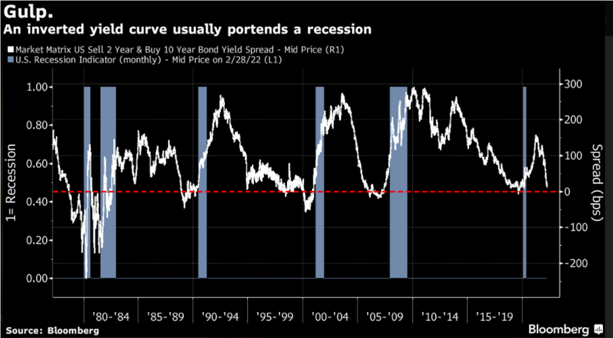
The above chart is taken from Bloomberg. And like it says, an inverted yield curve is a reliable predictor of a recession in the past.
As the chart shows, every time the white trend line breaks the horizontal broken red line in the middle of the chart, there is a recession within the following 12 months.
This chart shows the spread between the 10-year and 2-year treasury yields. See how close it is to breaking that red line?
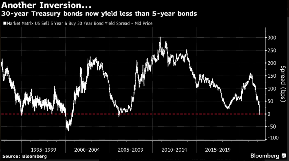
Here’s one for the 30-year and 5-year yield curve, which has inverted.
 Source: Bloomberg
So here the long-dated bonds (30-year) will earn you less interest or yield than a shorter dated one (5-year).
That’s not occurred in these bond spreads since 2006. I’m sure you recall what happened in the next few years after.
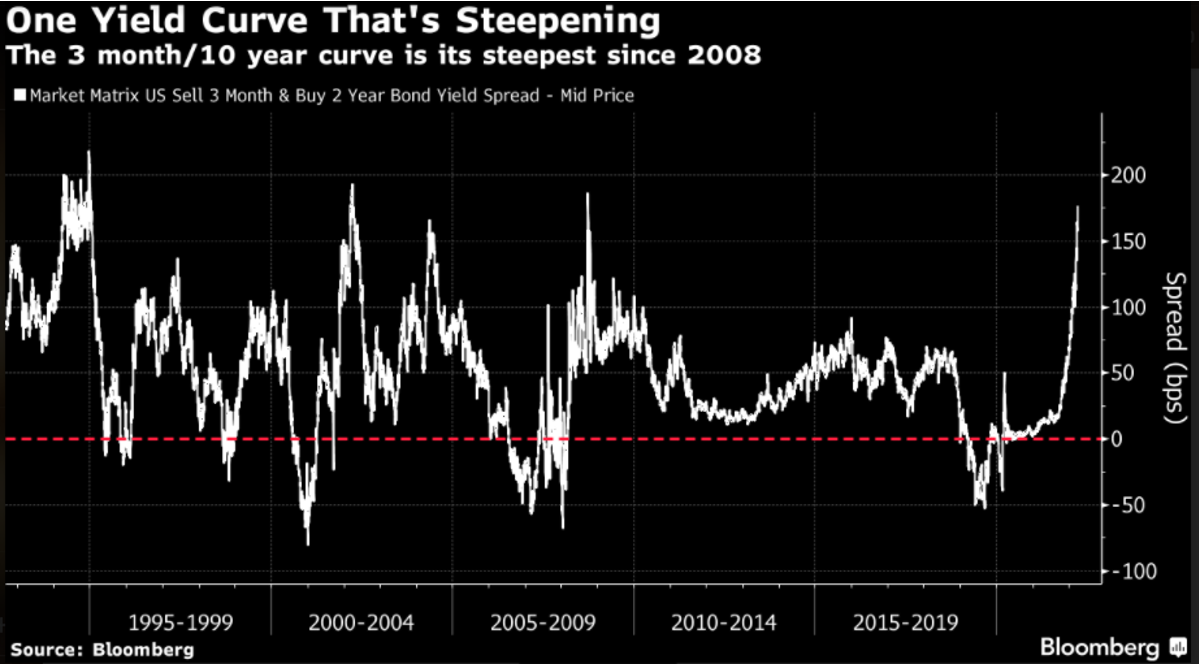
Ok, one more chart. Please note very closely which way the trend line is pointing compared to the two charts above.
 Source: Bloomberg
This is the 10-year and 3-month yield curve. And it’s taken off like a rocket!
It’s incredible how big the discrepancy between these 3 charts is.
But there lies the truth too.
Plus, our knowledge of the 18.6-year Real Estate Cycle.
It really IS different this time!
So how best to decipher the mixed messages we are seeing here?
Let’s push aside the incessant bleating from social media and the news in general about this.
We are talking about balance of probability here. I’ve no idea what else will occur around the world for the rest of the year. Things could occur that causes the US Fed to make a big mistake in its bond buying unwinding efforts for instance.
This would flow through to the bond markets.
So, let’s be calculated and rely on history to provide us the best answer possible.
I’m sure you can see this for yourself too; exactly which yield curve is the single source of truth when it comes to calling a looming recession or not?
Take the 30-year to 5-year yield curve (the 2nd chart). The historic evidence says that this curve isn’t predictive of any previous recession.
It never inverted ahead of 2020, ceased inverting almost two years before the 2008 recession, and provided a false positive in 1994.
So, the fact that it’s inverted, within both the real estate cycle and historical sense, is meaningless.
This is one such curve that’s attracting a lot of so-called ‘expert’ opinions.
But we can move on. What about the other yield curves here?
The 3-month (or short-term rate) to 10-year yield curve is the one that Property Share market Economics (PSE) use for our proprietary indicators page on our web page.
It’s the same curve that allowed us to bring to members attention when it inverted back in 2019 and what to expect come early 2020.
So, it has the runs on the board as one of the most reliable indicators we have to forecast a recession.
And right now, the trend on the chart is at complete opposites to the longer dated 30-year to 5-year chart.
They are both clearly sending different messages.
Here’s the field of play. Most US based investment houses are already reporting what they believe will be the near-term interest rate hikes to expect.
They report that the US Fed will tighten even more than they have currently provided via their ‘forward-guidance.’
Add to this the recent explosion in supply-related inflation and the fact US Fed Chairman Powell admitted the US central bank was ‘behind the ball’ here and it smacks of a snap readjustment of what exactly short-term rates should be?
This has resulted in the short-term yield curve pointing straight up.
As for the long-term yield curve, we need to remember that short term yields are driven by policy decisions whereas long term ones are driven by growth expectations.
Look again at that last chart; we have never experienced such massive intervention on the 10-year bond yield before. As the US Fed now unwinds its bond purchasing program it’s the equivalent of a brick being taken off the top of a spring.
With the artificial downward pressure now removed, thoughts of this yield curve turning negative are fading.
And then of course, there’s the most important part of the equation – a membership to the Boom Bust Bulletin.
It will teach you the history of the 18.6-year Real Estate Cycle, why it continues to repeat and show you the opportunities that it presents.
The Bulletin provides you the template of the economic cycle. We should never ignore the yield curve but the ability to frame the correct timing over what it tells us provides an amazing advantage when it comes to your long-term investments.
These charts here speak to the fact the last 10 years of suppressed yields can no longer be sustained.
And that the ‘time’ for a normalizing of these rates is at hand.
Impending recession? I’d say 200 years of real estate cycle history says something different.
I know it’s confusing, and the media only seems to make it even more so, but the 200 years of real estate history in the US remains your tried and tested lenses to this. Its time you understood it.
Grab this advantage for yourself today.
Sign up now.
Best wishes,

Darren J Wilson
and your Property Sharemarket Economics Team
P.S. – If you would like to receive weekly updates like this, sign up here.
P.P.S – Find us on Twitter here and go to our Facebook page here.
This content is not personal or general advice. If you are in doubt as to how to apply or even should be applying the content in this document to your own personal situation, we recommend you seek professional financial advice. Feel free to forward this email to any other person whom you think should read it.