If you would like to receive weekly updates like this, sign up here.
Have you heard about the following crazy story?
I’ll wager you haven’t. Even someone like me who is knee deep into the financial media haven’t heard a whisper.
And yet, it is a really important development if true. Perhaps the most important that is going to happen this year.
Here’s the thing: you really do have to tread carefully when it comes to publicly available analysis.
There’s a principle that they all share: garbage in = garbage out.
And so, when you read things about inflation or bonds in isolation take them with a large pinch of salt.
But…what if you find a chart on each that is telling you something that no-one at all is reporting?
And what if it is saying that the incessant noise and negative reporting that gets shoved down our throats is wrong?
Have I found such an item?
Have we been intentionally lied to about the future of inflation?
And if so, how does that affect your own personal investments?
Strap in, the following may well blow everything else you’ve read on the subject out of the water.
One swallow a summer does not make…., but how about two?
Let’s make one immutable point here.
The 18.6-year Real Estate Cycle has historically always been led by the United States. From start to peak to bust.
And as of today, this fact continues. I think by now, if you’ve been a Property Cycle Investor member for even a small while, you‘d agree with me here.
The US is right on track and is leading the world through the current cycle.
And it’s this fact that gives you the one amazing advantage this knowledge lends you.
Because for those who reside in the UK or Australia have a key advantage: forewarning of what will come next for their respective economies.
Yes, it does sound rather obvious, but the ramifications are astounding.
You can have first mover advantage over all other market participants if you know how to correctly action such knowledge.
I’d like to share two different charts with you today, from the United States, that taken together provide a great example of what I meant by the above.
And when you look, I ask you to just keep a thought concerning what the mass media have been screaming from the rooftops so far this year.
Ok? Right, here’s the first chart.
Source – Investing.com
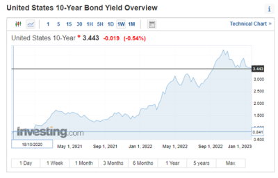
This is a weekly chart of the US 10-year Treasury bond yield. This dated bond is a very important economic indicator used by many analysts to determine the future direction of the US Federal Reserve interest rate decisions.
In this case, it shows very nicely the full effect of the US Fed’s rate raise campaign during 2022 as it tried to rein in ever increasing inflation.
I point your gaze to the top right hand corner of the above chart. You can see the black box has the number 3.443. This is the current yield as of this week (this is a weekly chart recall).
But can you see something else?
The yield has actually been falling since late 2022.
From a high of 4.219% in October 2022. That is not an insignificant fall. Could this signify the bond market starting to price in an end to future rate rises?
Certainly, it could. But here’s the second chart I’d like to share today.
Source – US Bureau of Labor Statistics.
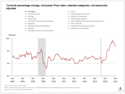
This chart is the 12-month rolling percentage change of US inflation. It uses select categories from the basket of goods measured by the consumer price index (CPI) to produce this graph.
As you can see it covers a 20-year period which is of interest to us. That’s because you can see there are 2 separate vertical grey lines which represent periods of recession in the US.
You can see the red line (representing the selected CPI goods tracked) falls precipitately within those 2 grey lines. Naturally, it’s measuring the cutting of rates and the withdrawal of liquidity and spending in general during these times.
This of course kills inflationary pressures. However, we know that those 2 grey lines represent something else. And that’s the land induced bust of 2008 last cycle and the 2020 mid-cycle recession for the current real estate cycle.
I ask once again however you cast your eyes to the top right-hand corner.
Very clear to see the huge spike in inflation we have all suffered through for almost two full years.
The peak per this chart was in June 2022 at 9.1%. But then something’s happened?
Inflation not only started to come down, but it’s also begun to collapse!
Why “aren’t” you told about these things?
I don’t advocate taking things at face value.
A healthy dose of skepticism is actually a very important part of analyzing news today.
So, on the surface it’s quite easy to start to pull apart this chart. The obvious problem is if you use a CPI measure then you can literally put anything you like in and take what you want out to.
As I mentioned: garbage in = garbage out.
However, let’s say this chart is only 50% accurate.
And that a fall from June to December 2022 of 2.6% is excessive. Even then, the trend is down.
I’m not hearing or seeing anywhere any news about this fact. Not today and certainly not back in June 2022.
But when you incorporate a chart that shows 10-year bond yields have also fallen, I start to listen.
My contention though is this: you don’t even need to be an expert in studying inflation or bond yield charts.
You just need to know how the land market works. Within the structure of the 18.6-year Real Estate Cycle.
Thanks to that, I know what’s coming next. My job then becomes to watch out for the how it will happen. And that part is generally different from cycle to cycle.
So, the time in the PSE property clock is a land boom at 1300. As you know this requires prodigious amounts of credit.
So, what if we make a proposition here? What if the US Fed is going to stop and then even start cutting interest rates during 2023. And the bond market is now pricing this in.
Due to the fact inflation is ebbing away.
This would start to pressure bank margins as the punchbowl is withdrawn. They now need to work harder to maintain the same level of earnings.
How do banks do that? It should be obvious, no?
They need to really start lending big time again. They are beholden to their shareholders, and the latter will demand ever increasing dividends especially if shareholders in other sectors are getting them.
It’s a set up. And it is time for this to be happening too.
It’s also time for you to act now that you know something important is happening. It is time for you to become our newest Boom Bust Bulletin (BBB) member.
It will teach you the full history of the 18.6-year Real Estate Cycle and why it continues to repeat to this very day. It can help you see how the cycle plays out and give you confidence and conviction in your investment decisions because you will learn how to time the economy.
There is no way possible you can hit your investment goals you’ve worked hard for yourself and your family by relying on social and financial media reports.
They will eventually work out what’s transpired here with inflation, but what, at least 6 months too late! Even longer.
That’s not how you develop your market edge!
So don’t wait, for only $47USD a year you can use the BBB to guide and teach you to view the world the same way I do.
And have the ability to know what comes next.
What an incredible advantage.
Best wishes,

Darren J Wilson
and your Property Sharemarket Economics Team
P.S. – If you would like to receive weekly updates like this, sign up here.
P.P.S – Find us on Twitter here and go to our Facebook page here.
This content is not personal or general advice. If you are in doubt as to how to apply or even should be applying the content in this document to your own personal situation, we recommend you seek professional financial advice. Feel free to forward this email to any other person whom you think should read it.


