


If you would like to receive weekly updates like this, sign up here.
“Oh, it’s easy”, said a contributor to WallStreetBets.
Just pick any SPAC on the US markets and you’ll earn 5 times your money at the same time it takes my Dad to do his ‘fundamental’ research!”
Have you heard something similar recently?
Arguably, you need to frequent social media platforms like Reddit and Twitter to find this kind of information.
Reddit is where you’ll find WallStreetBets, where young up and coming traders frequently share stock tips and experiences with other like-minded folk.
It’s certainly not where those more traditional, shall we say, Warren Buffett-type investors, who value diligent research and steady returns, will go to get informed.
So, who is right?
More pertinently, how do you invest or trade?
Are you a Robinhood trader who loves the no commission and ease of use it provides to buy international stocks? (translation: cool, hip, and fun)
Or do you prefer to put in the research, understand fundamentals and balance sheets before you put your capital at risk? (translation: old, boring, and out of touch)
These two schools often collide, piling scorn on each other with derisive memes and posts on social media, as the following cartoon illustrates.
 Source – @wallstbets
Well, what if I said to you, that they are both…. wrong!
Value investors will pore over piles of research looking for value and will hold that opinion as their stock investment literally goes nowhere for years.
Whereas Robinhood traders will invest on hype and ignore any semblance of what or how exactly their stock pick intends to increase earnings?
So, I stand by what I said; there is a far better way to do this. Its simple, repeatable and can be used across any market, Australian, UK, US, Iran…you name it.
And today, I will explain it to you.
Because the truth is, you can’t trust stock tips you read on social media, nor can you necessarily trust figures published by non-accountable auditors about a company’s balance sheet.
But you can rely on something that will never, ever lie to you.
Trust the chart.
At Property Sharemarket Economics (PSE) we don’t necessarily subscribe to a buy and hold strategy.
Instead, we prefer to use the active investment thesis of W.D Gann, one of history’s great stock traders.
We won’t go into his backstory today, but we will examine his tried, tested, and proven method of actively managing a stock portfolio.
And it’s quite simple, which is why we use it ourselves.
So, anyone of you reading can do this.
And here it is.
- Identify the sectors of the stock market who are outperforming the rest.
- Find the leading stocks within these sectors.
- Use your form reading (technical analysis) to identify the ideal time to buy.
That is it! Simple, right?
And it must be really. We are experiencing a social media driven lifestyle.
Today the younger brigade of traders and investors want their investment advice succinct, direct and less than 100 characters.
Hence the attraction of frequenting the likes of Facebook, Twitter and Reddit for investment tips and information.
But that’s also its Achilles heel. Those same self-professed experts are quick to remove their profile should they be caught out giving ‘pump & dump’ advice.
This is when a particular stock is in effect talked up to encourage buying, while those who ARE doing the sprucing sell their own positions to them.
Who do you trust with your own investments? At the end of the day, it must be your own responsibility. And the one thing in this world that wont ever lie to you?
A stock chart.
A chart simply plots the key price levels to identify the true trend, and when to expect it.
Read now as I show you just how simple yet powerful this method can be for you.
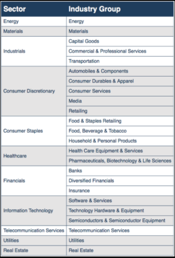
Global Industry Classification Standard.
The above (GICS) is a globally recognized method of breaking down stock markets across the world into its constituent sectors.
These then allow further break down into sub sectors. The key here is its globally recognized and can be used across many different markets.
 Source – Market index
For this example, lets use Australia’s version of the GICS and its 11 sectors. The same classifications are used in the US, UK and elsewhere.
We want to know which sectors have outperformed recently and thus can be expected to remain so.
And stay away from those which are underperforming.
So, how do you tell the difference?
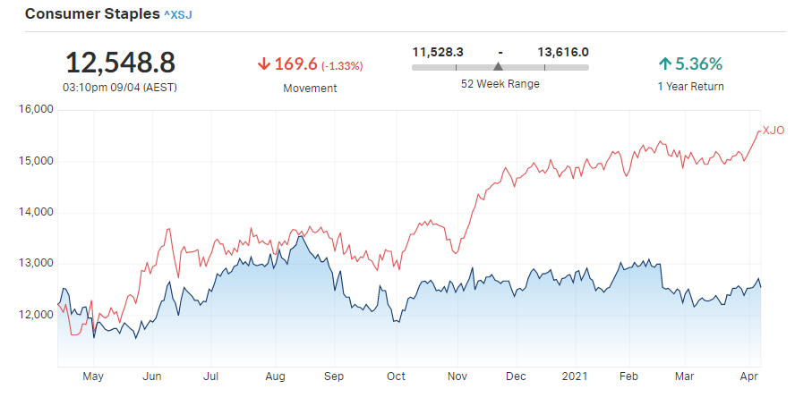
Let’s start with Consumer Staples (ASX – XSJ)
 Source – Market index
What you are looking for is the blue shaded area, and whether its below or above the red line which represents the XJO – The Australian ASX200.
So, the blue line in the above chart represents the price of Consumer Staples (XSJ) relative to the XJO.
And it’s ugly!
In fact, since mid-November last year the gap between them has grown even larger.
Translation; stay away! Your capital is arguably better deployed than stocks in this sector.
Let’s look at another sector then, one that is moving the way we want it.
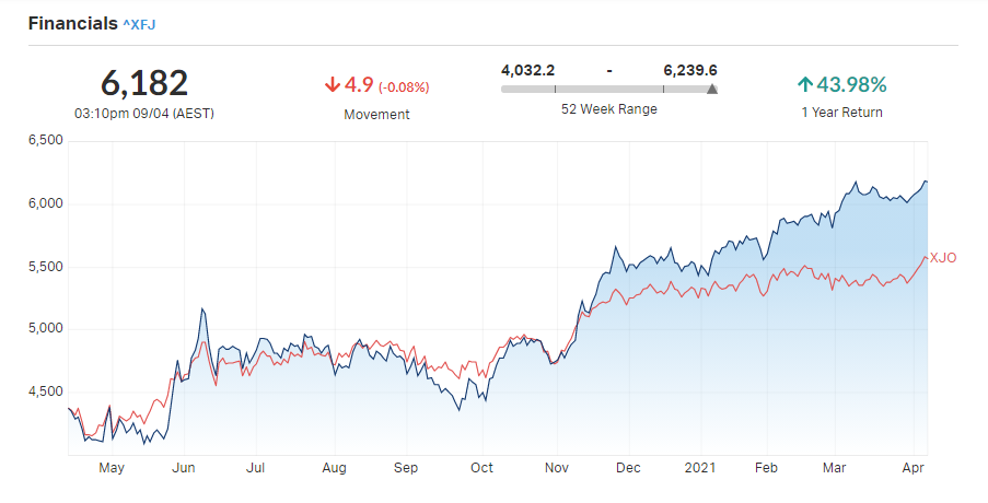
What is the financial sector saying?
 Source – Market index
Well now, this is more interesting.
It appears the opposite is occurring here. In mid-November, the blue line (XFJ) has now overtaken the red line (XJO) and is now a sector that’s outperforming the index.
This is what you want.
So now, lets look at stocks within this financial sector and use a bit of form reading to determine which stocks are the strongest within an outperforming sector.
In this case, ‘form reading’ means identifying the trend on the chart to determine the sentiment of buyers and sellers.
 Source – Optuma
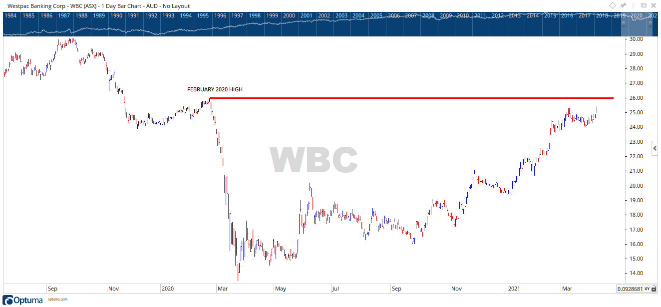
Above is the chart for West Pac bank (ASX – WBC). And just like the sector chart, it’s been on a tear for many months now.
Note however, the price level has reached a previous key high back in February 2020. The price action is showing you this key high is now strong resistance (red horizontal line).
Hence the price is accumulating somewhat below. Its needs more energy and buying power at this level before it can break out.
At least, that’s what it is telling me.
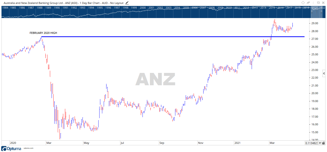 Source – Optuma
Here is the chart of another bank, ANZ Bank (ASX – ANZ). This set up is different.
You will notice the price is currently above the February 2020 high (blue horizontal line). And the price is accumulating above this level in a way that forms the bottom of a cup.
It’s a technical pattern that is generally bullish.
A break above $29, should it hold, could make for a good entry with clear stop loss levels to protect your capital if you are wrong.
So, there we are.
Next time you hear or read about a “hot tip” on social media why don’t you follow these 3 simple tests to determine how much validity you should give it.
As former US President Ronald Reagan is quoted as saying – “Trust… but verify”.
Find the best sector, identify the strongest stocks, and use your technical knowledge to know when and how to both buy and sell.
The beauty of this method is it shows you who the guys with the big money are voting for, and those funds moving both into (financials) and out of (consumer staples) will be shown via a chart.
The one remaining question is: how are your technical skills?
Are you confident in what the above charts are saying?
Do you know what you should do, and more importantly what not to do?
Because I have something that can really help teach it to you.
It’s called the Boom Bust Bulletin.
Designed to give you the full history of the real estate cycle, why it repeats and how to best take the plethora of opportunities it will present.
And more importantly, teach you how to read a chart and learn what it is telling you about time, price, and future movement.
All for a few cups of coffee a week, talk about easy money!
You will find the information about the real estate cycle bulletin provides you nowhere else.
It is 100% exclusive to Property Sharemarket Economics.
Incredible value.
Join us on this journey.
Best wishes

Darren J Wilson
and your Property Sharemarket Economics Team
P.S – Find us on Twitter under the username @PropertySharem1
P.S.S – Go to our Facebook Page and follow us for right up to date information on the 18.6-year Real Estate Cycle.