I am not going to lie to you.
I have waited for this moment all year long.
As 2020 continues to roll to a close, it is this time each year that some of the most renowned real estate research companies begin to release data on the state of real estate worldwide.
Given that three quarters of the current year has now passed this information is now readily at hand.
And the evidence that these reports are showing are offering further proof of where we are in the 18.6 Real Estate Cycle.
In fact, what they clearly show goes against everything you may have heard, watched or read about real estate in 2020.
So today, we will look at some charts.
We will review several of them provided by the Domain Group.
Domain Group is a large real estate listings company, and their research house provides global research displayed in the form of interactive charts.
They have recently released a large amount of research on the state of some of the world’s biggest real estate markets.
Now is the perfect time to apply our 18.6-year Real Estate Cycle lens and examine them.
And make a solid summation of events.
Believe me, when you read the conclusion I have come to at the end of these charts, I am confident almost no-one will disagree!
So now, let’s examine these charts, the commentary for each is mine.
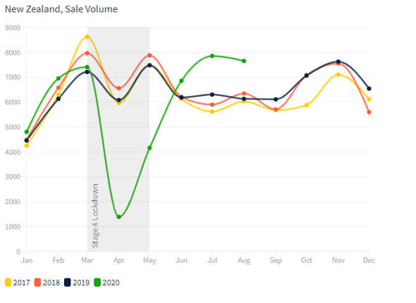
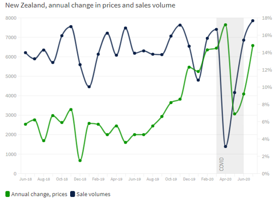
Firstly, here is a chart for New Zealand (NZ).
Take note of the green colored line.
Source – Domain.com
Source – Domain.com
Can you see the grey vertical column in both charts?
It represents stage-4 lockdown laws in place in NZ during the height of the COVID 19. During this lockdown no in-person inspections were allowed.
However, the same applies for the following charts, just bookmark the above statement for now.
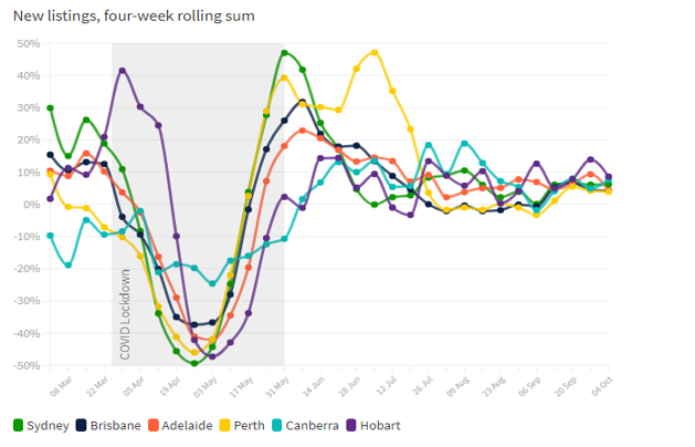
Now some charts from Australia.
Source – Domain.com
A bit of a mess here, but just focus on the “V” shaped recovery of each curve into and out of the vertical grey column.
Source – Domain.com
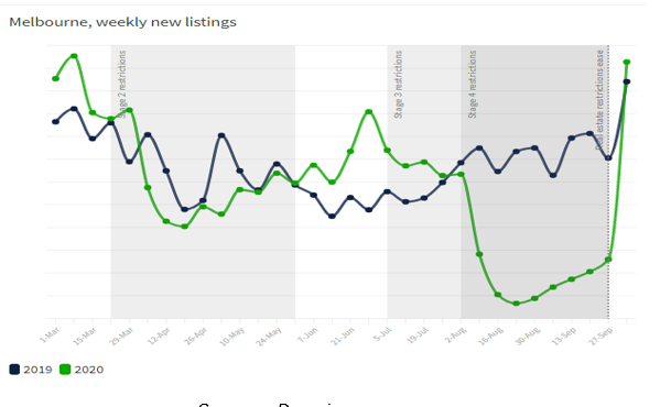
You can see the normal seasonality in the Melbourne real estate market here since 2019. The greyed columns however relate only for the green line (2020). Victoria instituted some of the most severe lockdown laws in Australia, if not the World.
Some United Kingdom (UK) stats next.
Source – Domain.com
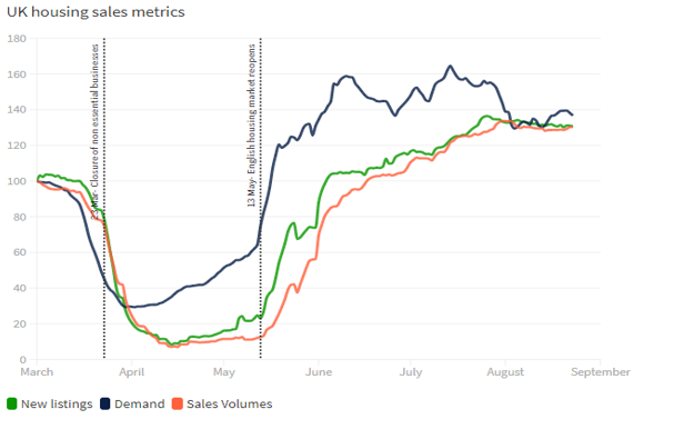
The three lines above are charting new listings, demand and sales volumes. Of interest are the two vertical lines; the left hand one indicates when non-essential business was forced to close and the right hand one is when the UK housing market reopened.
Finally, we look at the United States, where we find some interesting results.
Source – Domain.com
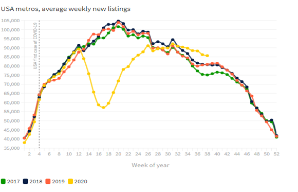
We have average weekly new listings for the last 4 years. Normal seasonality buying patterns in the US means a uniform arch to this chart. The obvious exception though is the yellow (2020) line.
Note also the yellow line is well below the usual peak seen during Spring. It appears listings are well below their usual peak for this time of year.
Source – Domain.com
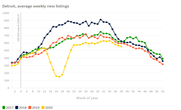
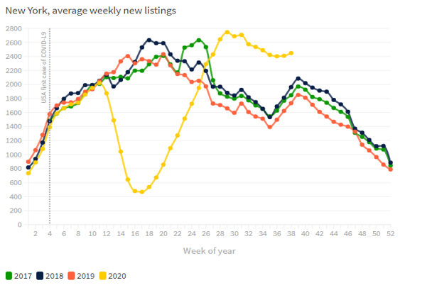
For a more city centric view, we have Detroit’s numbers above, and New York’s below.
Source – Domain.com
Here, New York is seeing strong demand out of the COVID19 recessionary dip. The highest seen in the last four years in fact.
Ok, so a lot of information to unpack here.
Let me help you out.
Firstly, please revisit each chart, and look specifically at each US charts yellow (2020) line. For the others, you are looking at the greyed out vertical columns.
You can see that each respective chart displays a basic “V” shaped line.
These represent the decline of listings and overall sales volumes for real estate across various countries.
And yet, what goes down…
Please note that real estate listings and sales volumes have recovered to pre-lockdown levels during the last 3 quarters in NZ.
Also note the same pattern for Australian capital cities.
For the UK, sales, demand and listings have rocketed higher than before the non-essential economic lockdown began!
The one outlier has been the US, at least according to these charts.
Given the US real estate market is the largest on earth, should this be of significant concern?
Put simply, no.
There is an incredible statistic uncovered by Domain during their research.
From their recent research report,
The tougher the lockdown, the quicker the bounce back for the property market, an analysis of listings in cities around the world has shown.
New property listings in Australia, New Zealand, the UK and the US all fell significantly during respective lockdowns, but the rebound has varied depending on the severity of the restrictions, the analysis by Domain showed
Hang on, the restrictions are responsible for this recovery?
How did they work that out? Further from the same report.
In New Zealand and the UK, where lockdowns were strict and all but shut down the housing market, the rebound in listings and sale volumes was “unseasonable”.
“You’ve got this snowball effect where the longer the lockdown, the more people are waiting to transact, so the rebound is stronger,” Domain senior research analyst Nicola Powell said.
This contention is fully backed up by the data. According to Domain research for example, the Australian city of Melbourne did not begin to ease stage 4 restrictions on in-person house inspections until early October.
Weekly listing had dropped by 70% during lockdown (the average in Australia was between 40-50%) but by October 4th had bounced back by 241% compared to the previous week.
But what about the US?
Well it appears the fact the US chose to enforce semi-lockdowns still saw listings drop significantly, but the slower recovery meant pent-up demand did not reach the same heights as in other countries.
“If you have a semi-lockdown, some people are gamer to transact,” Dr Powell said.
She said the lower pent-up demand to buy and sell in the US meant the rebound was slower, though New York was a notable exception – listings there jumped much higher than they were in July 2019.
So, the ability in the depths of the COVID19 recession to still be able to transact on property sales simply means the withdrawal of supply was less severe than elsewhere.
Alright, you ready now for my conclusion?
Here it is.
Despite a once in 100 year pandemic, with all the dislocation it caused to global healthcare systems, the inevitable plunge into recession for almost every economy of the developed world, and the at times bungled government response to it all, the real estate cycle continued to turn.
Just as history had suggested it would.
It is my contention that with the release of these charts, the Property Sharemarket Economics (PSE) research was able to show PSE members that for 2020 thus far, that real estate markets around the world would not collapse was accurate.
And that now is the time to take advantage and buy property at the cheapest prices they will be for the next decade was also accurate.
Go and recheck the charts if you do not believe me.
For mine, it’s pointless trying to argue the facts here.
But what is even more important for me is, did you take advantage of this once in a decade buying opportunity?
Did you benefit from the world class research and market guidance of the PSE team to secure your dream home at decade lows?
Or did the scare campaign on the news and social media convince you that real estate was finished and HAD to crash?
I will leave the evidence above and let you decide that.
But it is worth remembering that, should the history of the 18.6-year Real Estate Cycle continue to repeat, each year that passes will see land and property prices simply increase every year.
One opportunity may have passed, but there will be plenty of opportunities opening as the 18.6-year Real Estate Cycle continues to turn.
If you want to educate yourself further about the Real Estate cycle then subscribing to the Boom Bust Bulletin is a great place to start. Click HERE to find out more.
Best wishes

Darren J Wilson
and your Property Sharemarket Economics Team


